The X demoparty in Holland happened last weekend, and like every time, it’ s the end-all be-all of Commodore 64 demoparties. Its legendary status has been gained for having breakthroughs in C64 coding happen every time it takes place, and this year it has been no different.
The number of releases in this edition has been very high, showing a welcome rise in C64 demoscene activity and it also has brought back into the scene a lot of well known names from back in the day, who were retired.
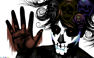
I’ll start up with gathering the releases happening in the GRAPHICS competition. I’ll show you my highlights after the jump, in reverse order of personal preference. You can compare with the actual X’ ranking to see how varied each person’s view can be:
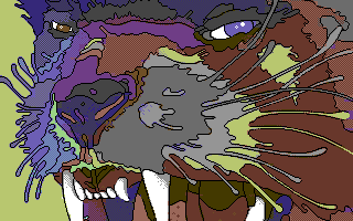
11. Electric – Tiger (Ranked #10 at X’2010)
This piece is particular because of two things: one, Electric’s return to the C64 platform, and two, the very different stylistic approach it has compared to other C64 pieces. Electric has chosen to steer away from gradients and typical pixel techniques and went for a flat color, pictoric look for his piece.
10. Ooz – Don’t turn (Ranked #23 at X’2010)
A recurring theme in this year’s X’: Other scene pixel artists getting into the C64 (thanks to dely, I learned Ooz is from Atari, not Spectrum scene). I guess they realize how crappy their platform is (#systemwars still apply :P).
You can tell how graphicians come from other platforms because they approach the pixeling in very different ways, I really like the cross over and how his style gets into the C64. As said in CSDb, this guy can really draw really good black outlines on characters, usually a common problem for C64 graphicians I think.
09. Uka – Woe Baby You’re A Nag (Ranked #27 at X’2010)
Very particular style and, again, not very C64-demoscene-like. Using Hires mode, Uka creates a very special piece.
08. Deev – Dislocate (Ranked #4 at X’2010)
Deev delivers a very interesting picture. On one side there’s the classical C64 color work with nicely pixeled gradients etc., but on the other side there’s a very strong picture that uses a shade/outline to convey its message. Very, very well done.
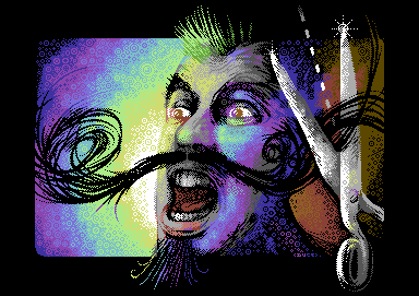
07. Duce – Must Ache The Moustache (Ranked #2 at X’2010)
Excellent pixel work by Duce of Extend. This piece is in High Res mode, and if you know a bit of how the C64 graphics work, you will realize this is a tremendous feat because this mode is very limited. I am not a huge fan of the motive or color usage so that’s why this is ranking so “low” on my personal list.
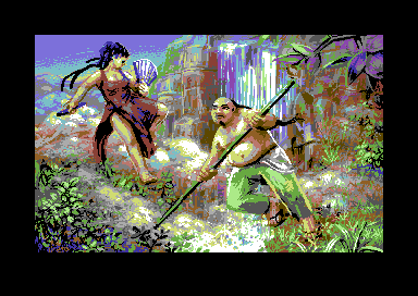
06. Veto – 25 Years of Yie Ar Kung Fu (Ranked #1 at X’2010)
Veto s basically the master of High Res art on the C64 right now. He has developed a very particular style and has learned to break the limitations of High Res mode in a very particular way. This piece is probably my favourite from him, the shifts between colors are a lot more subtle and detailed than in his previous works. The videogame thing is very MEH to me and the girl seems to be out of place a bit, and those are the only two issues that made me put this halfway on the list.
05. riskej – Captain Nino’s Show (Ranked #15 at X’2010)
Yet another Spectrum graphician making the jump to the C64. riskej is a legend in the Speccy scene and I am happy he decided to enter the C64 bandwagon too :D. This picture shows clearly many of the traits of Spectrum pixeling, like in the way he dithers colors and the predominance of black in the piece. It’s an “upgrade” of a work he’s done for Spectrum already so I put it a few places below the list because of “lack of originality” (it is still his original piece).
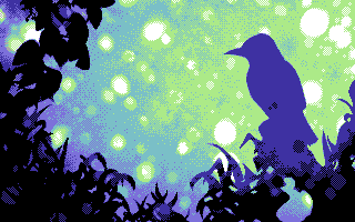
04. ptoing – Headache (Ranked #25 at X’2010)
“Ranked #25 at X’2010”??? I seriously do not understand how this awesome piece could have ranked so low. I guess people on the demoscene work with a lot of preconceptions on how a graphic should look or what techniques it should have. This piece, albeit a bit simpler on technique (It’s High Res + Sprites though, not the easiest one to pixel for anyway), is very high on style and concept. It’s using colours extremely well and comes across very strongly. Perhaps at some point the demoscene will leave a bit its “old habits” which I think are detrimental to itself, and start accepting new ways of expression in it :)
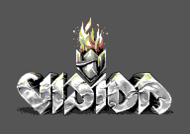
03. Sander – Demoscene Logo (Ranked #12 at X’2010)
Another “I think this should have ranked higher” pic. This picture is reminiscent of the good old Amiga logos shown in many demos, and if you don’t pay close attention, you COULD say this was done on the Amiga. Excellent pixeling technique and use of colour, as Sander usually has us used to. I can’t believe how this guy pushes Multicolor mode to the extreme.
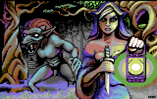
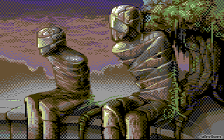
Carrion – Still Waiting (Ranked #6 at X’2010)
This is probably one of the best C64 pictures of late. The use of colour is spot on, you clearly can think there are many more than what the C64 is capable for, and with no interlacing in sight. The theme is cool and it conveys a strong image perfectly. Even though the main characters have no black outlines, they are perfectly separated from the background. Carrion is a pixel beast and this picture probably should have scored a bit higher in the compo.
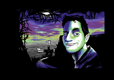
Louie64 – Blood Vanilla (Ranked #5 at X’2010)
Louie64 is no newcomer to pixeling, even though he started to pixel on the C64 recently. Louie64 used to be Louie500 and he kicked Amiga graphic ass mainly in The Black Lotus. He created many legendary pictures and was one of the top names of Amiga pixels on the scene. I am super glad he’s come back because he is pushing some really mad shit together with the Fairlight guys.
This picture has everything I like in a good picture: excellent technique, a strong concept and proper art direction. I guess people are still not used to this kind of thing, but it ranked pretty high anyway. The circumvention of High Res limitations is very good, it surprises me how easily Louie has adapted to the restrictions of the C64 coming from a much less restrictive Amiga, but this shows how good he is when working with limitations. I hope he continues to bring many more pixel joy to the C64 scene (and return to the Amiga, man!)
That’s it for graphics, on the next installment, I’ll try to showcase my top list of music released at X’2010.


